For iOS app developers, creating seamless and visually appealing chat experiences is paramount. QuickBlox offers an iOS Chat UI Kit that simplifies the process of integrating chat functionalities into your app. However, with every unique app comes the need for customization, and that’s where we step in to guide you through the process of personalizing the color theme and settings of your QuickBlox iOS Chat UI Kit.
Whether you’re a seasoned developer or just starting out, our step-by-step tutorial below will equip you with the knowledge and tools you need to make your app’s chat interface stand out from the crowd.
Let’s get started and unleash your creativity with QuickBlox!
Don’t forget to review our earlier blog about Getting Started with the QuickBlox iOS UI Kit.
Understanding the Importance of Customization
Before we dive into the technical details, let’s discuss why customization is so crucial for your app’s success. As a developer, you already know that user experience plays a pivotal role in the overall success of any application. When users find an app visually appealing and intuitive, they are more likely to engage with it, recommend it to others, and keep using it in the long run. By customizing the color theme and settings of your QuickBlox iOS Chat UI Kit, you’ll be able to:
- Align the Chat Interface with Your App’s Branding: Maintaining consistent branding across all elements of your app, including the chat interface, enhances brand recognition and reinforces a sense of trust and familiarity among users.
- Create an Immersive User Experience: Thoughtful color choices and intuitive settings can make navigation more user-friendly, allowing users to focus on communication without distractions.
- Stand Out from Competitors: With countless chat apps available in the market, customizing your QuickBlox iOS Chat UI Kit will help differentiate your app, making it memorable and distinct.
Customizing the Color Scheme
The QuickBlox iOS UI Kit contains a default color theme consisting of Light and Dark.
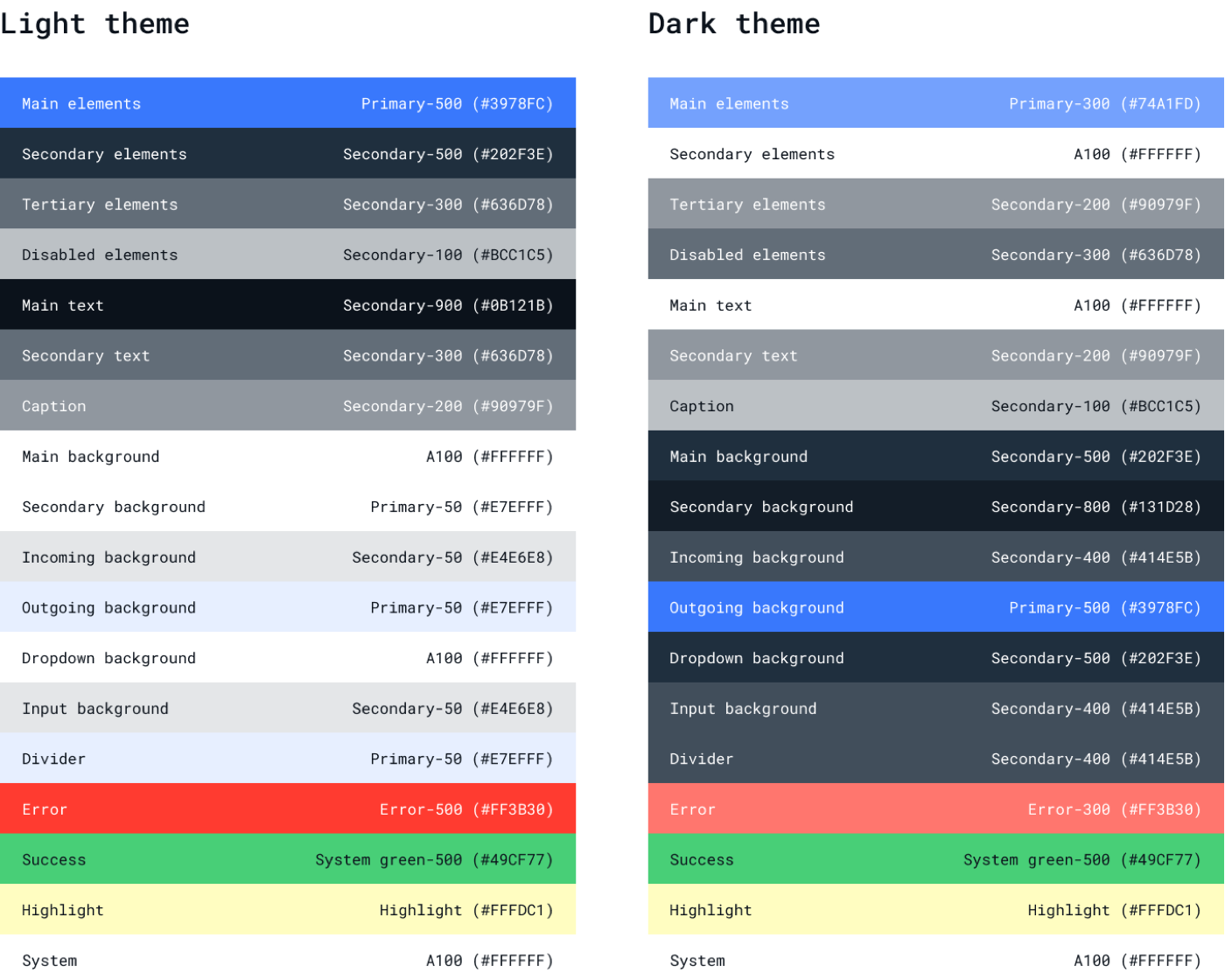
To save you time, feel free to use our default color scheme. But if this isn’t the right look that you’re wanting to create for your app, no problem. Our UI Kit is flexible enough to allow you to customize your own color palette should you choose.
Let’s look at how this can be done.
Step 1: Getting Started
To get started with the QuickBlox iOS UI Kit, you’ll need a QuickBlox account. If you don’t already have one, you can easily register for an account on the QuickBlox website.
We recommend that you download our UI Kit Sample. We’ve implemented the color theme customization steps in this sample and provided additional examples, including the ability to change the color scheme by the user. This sample already has a QuickBlox iOS UI Kit connected as a Swift Package.
To start interacting with QuickBlox, you need to create an application using the QuickBlox admin panel. For more details on how to do this, read our previous blog, How to Create an App and Use the QuickBlox Admin Panel.
Fill in the required fields with the secret keys of this application to initialize the QuickBlox SDK.
In the UI Kit Sample, go to the Connect class and fill in the appropriate fields:
class Connect: ObservableObject {
    @Published var state: ConnectState = .waiting

    init(state: ConnectState = .disconnected) {
        self.state = state
        Quickblox.initWithApplicationId(0, // Your_Application_ID
                                        authKey: "", // Your_Authorization_Key
                                        authSecret: "", // Your_Authorization_Secret
                                        accountKey: "") // Your_Account_Key


        QBSettings.carbonsEnabled = true
        QBSettings.autoReconnectEnabled = true
    }
    ...
}
If you want to create your new iOS SwiftUI project with Xcode you can read our earlier blog: Getting Started with the QuickBlox iOS UI Kit. This guide will walk you through the process of setting up and accessing your App credentials in the QuickBlox Admin Panel, which you will need in Step 3 of this guide.
Great! Now you’re ready to start customizing your color theme!
Step 2: Customize color theme of QuickBlox iOS UI Kit into your application
Now that you have your SwiftUI iOS project setup, it’s time to set up your color theme for the QuickBlox iOS UI Kit in your app.
First, let’s get acquainted with the default color theme of the QuickBlox UI Kit.
public class ThemeColor: ThemeColorProtocol {
    public var mainElements: Color = Color("MainElements", bundle: .module)
    public var secondaryElements: Color = Color("SecondaryElements", bundle: .module)
    public var tertiaryElements: Color = Color("TertiaryElements", bundle: .module)
    public var disabledElements: Color = Color("DisabledElements", bundle: .module)
    public var mainText: Color = Color("MainText", bundle: .module)
    public var secondaryText: Color = Color("SecondaryText", bundle: .module)
    public var caption: Color = Color("Caption", bundle: .module)
    public var mainBackground: Color = Color("MainBackground", bundle: .module)
    public var secondaryBackground: Color = Color("SecondaryBackground", bundle: .module)
    public var tertiaryBackground: Color = Color("TertiaryBackground", bundle: .module)
    public var incomingBackground: Color = Color("IncomingBackground", bundle: .module)
    public var outgoingBackground: Color = Color("OutgoingBackground", bundle: .module)
    public var dropdownBackground: Color = Color("DropdownBackground", bundle: .module)
    public var inputBackground: Color = Color("InputBackground", bundle: .module)
    public var divider: Color = Color("Divider", bundle: .module)
    public var error: Color = Color("Error", bundle: .module)
    public var success: Color = Color("Success", bundle: .module)
    public var highLight: Color = Color("HighLight", bundle: .module)
    public var system: Color = Color("System", bundle: .module)

    public init() {}
}
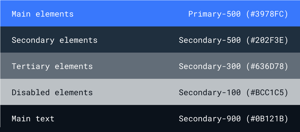
The default theme conforms to the ThemeColorProtocol protocol which describes the required set of colors to correctly display the UI. This theme supports Light and Dark schemes which are configured with ColorSet in XCode:
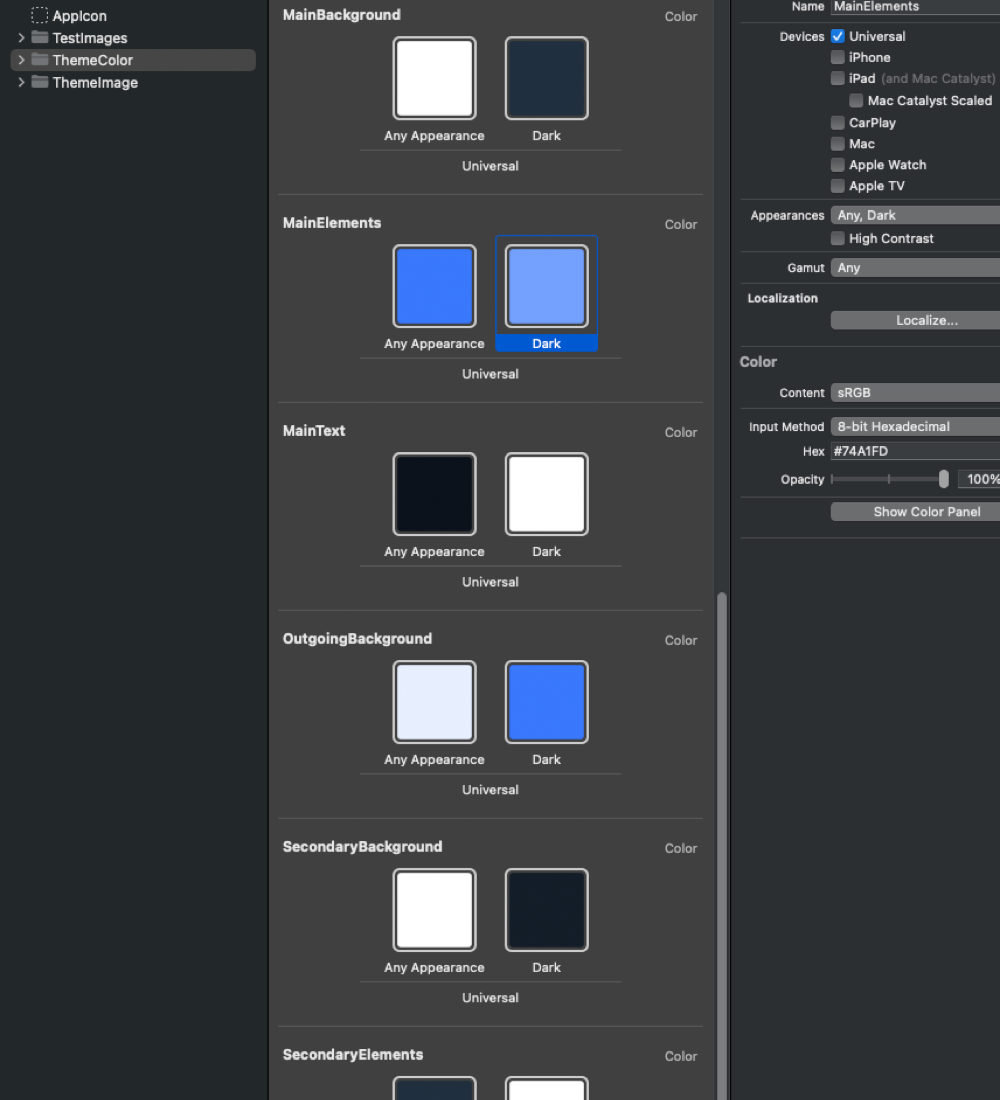
If you are not yet using Color Assets in your application, you can get acquainted with them in the documentation from Apple documentation.
Let’s create a MyAmazingColorTheme class that conforms to QuickBloxUIKit.ThemeColorProtocol and initialize it with our own colors:
class MyAmazingColorTheme: ThemeColorProtocol {
    var mainElements: Color = Color(uiColor: UIColor { traitCollection in
        traitCollection.userInterfaceStyle == .dark ? UIColor.blue
        : UIColor.cyan
    })

    var secondaryElements: Color = Color(uiColor: UIColor { traitCollection in
        traitCollection.userInterfaceStyle == .dark ? UIColor(hex: "#3978FC")
        : UIColor(hex: "#74A1FD")
    })

    var tertiaryElements: Color = Color.black
    var disabledElements: Color = Color.black.opacity(0.5)

    var mainText: Color = Color("Your_MainText")
    var secondaryText: Color = Color("Your_SecondaryText")
    var caption: Color = Color("Your_Caption")
    var mainBackground: Color = Color("Your_MainBackground")
    var secondaryBackground: Color = Color("Your_SecondaryBackground")
    var tertiaryBackground: Color = Color("Your_TertiaryBackground")
    var incomingBackground: Color = Color("Your_IncomingBackground")
    var outgoingBackground: Color = Color("Your_OutgoingBackground")
    var dropdownBackground: Color = Color("Your_DropdownBackground")
    var inputBackground: Color = Color("Your_InputBackground")
    var divider: Color = Color("Your_Divider")
    var error: Color = Color("Your_Error")
    var success: Color = Color("Your_Success")
    var highLight: Color = Color("Your_HighLight")
    var system: Color = Color("Your_System")

    init() {}
}
You may notice that different constructors are used to set the colors – this is done to cover all the possible options in this example, but you can already choose the one that suits you best.
1. The color is set using the constructor that allows you to set colors for the Light and Dark schemes:
var mainElements: Color = Color(uiColor: UIColor { traitCollection in
        traitCollection.userInterfaceStyle == .dark ? UIColor.blue
        : UIColor.cyan
    })
2. In this version, the same constructor is used, but the UIColor extension is used to make it convenient to use the Hex String:
    var secondaryElements: Color = Color(uiColor: UIColor { traitCollection in
           traitCollection.userInterfaceStyle == .dark ? UIColor(hexRGB: "#3978FC") ?? UIColor.white
           : UIColor(hexRGB: "#74A1FD") ?? UIColor.black
    })
And this is an extension for UIColor:
extension UIColor {
    convenience init?(hexRGB: String, alpha: CGFloat = 1) {
        var chars = Array(hexRGB.hasPrefix("#") ? hexRGB.dropFirst() : hexRGB[...])
        switch chars.count {
        case 3: chars = chars.flatMap { [$0, $0] }
        case 6: break
        default: return nil
        }
        self.init(red: .init(strtoul(String(chars[0...1]), nil, 16)) / 255,
                green: .init(strtoul(String(chars[2...3]), nil, 16)) / 255,
                 blue: .init(strtoul(String(chars[4...5]), nil, 16)) / 255,
                alpha: alpha)
    }
}
3. Here the Color is set using the default constructor with no support for automatic color switching when changing Light and Dark schemes:
    var tertiaryElements: Color = Color.black
    var disabledElements: Color = Color.black.opacity(0.5)
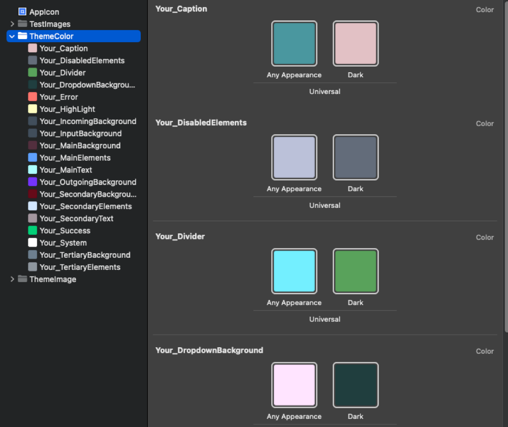
4. In this case, the Color is set using Color Sets. This is how the default color theme is done, as already mentioned above. Colors will change between Light and Dark schemes:
    var mainText: Color = Color("Your_MainText")
    var secondaryText: Color = Color("Your_SecondaryText")
… and so on for other colors.
It will look something like this, but with your colors:
Now that you’ve successfully created your color theme, it’s time to apply it to QuickBlox iOS UI Kit’s screens.
To do this, let’s create a MyAmazingTheme class corresponding to QuickBloxUIKit.ThemeProtocol, which obliges us to do initialization with ThemeColorProtocol, ThemeFontProtocol and ThemeImageProtocol:
class AppTheme: ThemeProtocol {
    var color: ThemeColorProtocol
    var font: ThemeFontProtocol
    var image: ThemeImageProtocol

    init(color: ThemeColorProtocol,
         font: ThemeFontProtocol,
         image: ThemeImageProtocol) {
        self.color = color
        self.font = font
        self.image = image
    }
}
Next, we create an object of this class:
var appTheme: AppTheme = AppTheme(color: MyAmazingColorTheme(),
                                      font: QuickBloxUIKit.ThemeFont(),
                                      image: QuickBloxUIKit.ThemeImage())
Later we will also look at how to customize Font and Images in the QuickBlox iOS UI Kit.
Now it remains to install your theme. You can do this in a place convenient for you in your application, for example, at the entry point to the QuickBlox iOS UI Kit:
import SwiftUI
import QuickBloxUIKit


struct ShowQuickBlox: View {

    init() {
        var appTheme: AppTheme = AppTheme(color: MyAmazingColorTheme(),
                                          font: QuickBloxUIKit.ThemeFont(),
                                          image: QuickBloxUIKit.ThemeImage())
        QuickBloxUIKit.settings.theme = appTheme // Color theme customization.
    }

    var body: some View {
        QuickBloxUIKit.dialogsView() // The entry point to the QuickBlox iOS UI Kit.
    }
}
Congratulations! You have successfully customized the color theme of the QuickBlox iOS UI Kit in your app.
In some popular applications, developers allow the user to choose the color theme. If you are interested in how to implement this functionality in your application, pay attention to one of the options for implementing this feature in our UI Kit Sample.
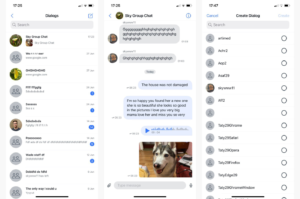
Here’s an example of a screen that allows the user to choose the color theme themself:
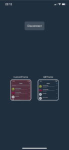
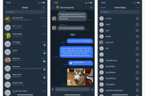
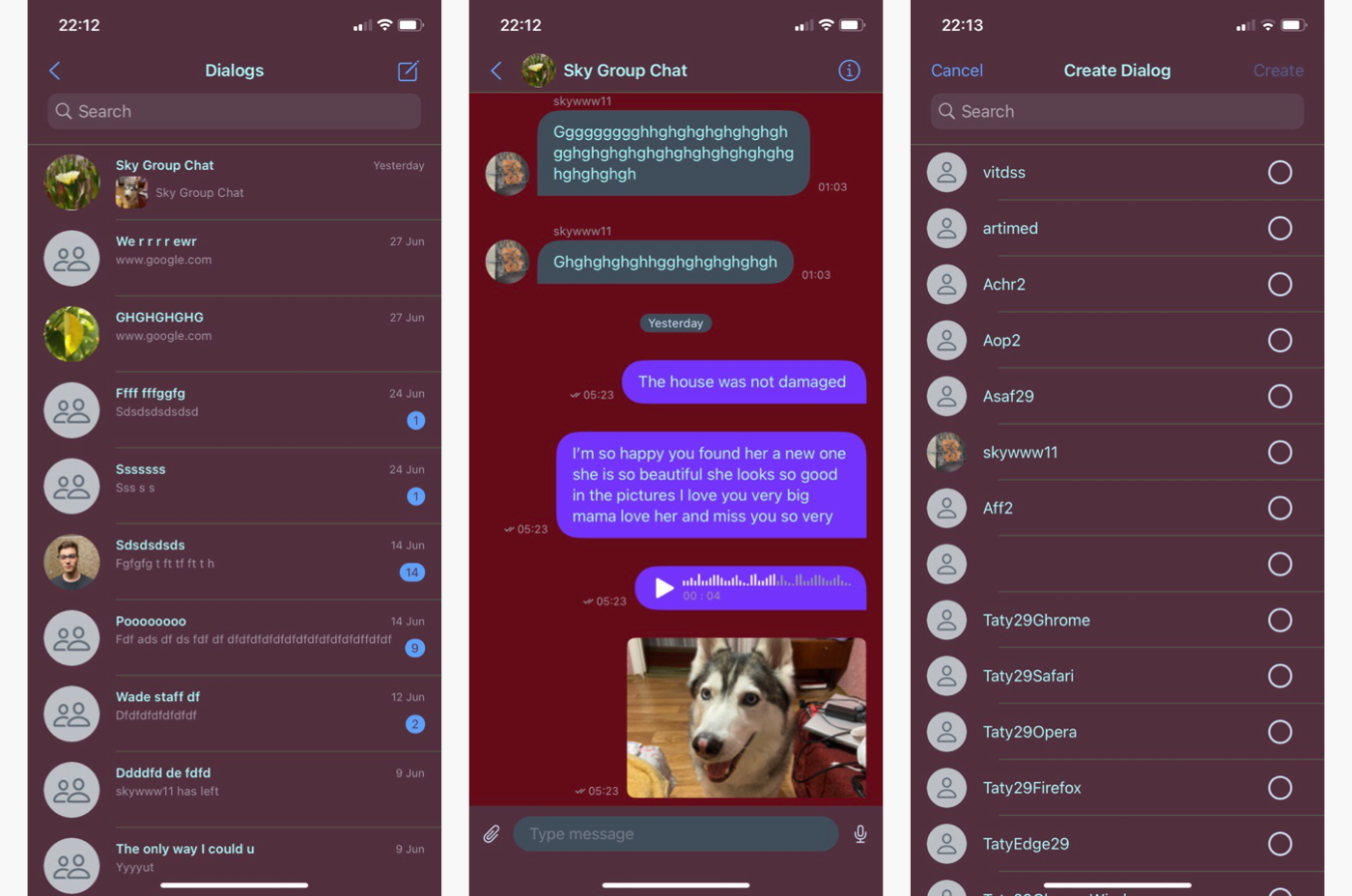
This is what my custom color theme looks like:
Wrapping up
In this article, we explored the process of customizing the color theme of the QuickBlox iOS UI Kit to suit your app’s aesthetics. In the upcoming sections, we will delve into customizing the Fonts and Images for a more personalized look.
We are actively expanding the functionality of our UI Kits by introducing new features, resolving bugs, and optimizing performance and stability. Your valuable feedback and suggestions regarding additional functionalities needed for your projects are highly appreciated. If you have any questions concerning the integration of the UI Kit into your application or its settings, feel free to reach out to the developers through GitHub or Discord.
Have Questions? Need Support?
Join the QuickBlox Developer Discord Community, where you can share ideas, learn about our software, & get support.
Join QuickBlox Discord
 AI Agent — automate conversations and workflows. Now available on Free plan